
The following Color Shuffle button changes the color palette of the page only, with no screen reader indication.
WEB DESIGN IN 2021
A new year marks the possibility for change and progress.
Are you ready? We are.
The report

Here are the major themes that will dominate the digital design industry this year and the role they’ll play in the work we create.
LIFE ON
screen
IMMERSIVE DIGITAL EXPERIENCES ARE REPLACING IRL.


The screen will surpass our real-world expectations by creating stimulating, immersive experiences that make up for what we’ve lost in real life. Robust platforms will blur the boundaries between real and virtual by creating practical experiences—like attending a concert or lecture—that are spatial and rich with elaborate visual effects.
THE WEB IS WHERE WE LIVE
THE WEB IS WHERE WE LIVE
THE WEB IS WHERE WE LIVE
THE WEB IS WHERE WE LIVE
THE WEB IS WHERE WE LIVE
The world’s first online street food festival experience allows users to interact with others and order from food vendors using customizable avatars. Design by Reprise Digital Malaysia, website built by Ministry XR.
Visual journalism by the Research & Development team at The New York Times which fully reconstructs spaces in 3D, enabling them to be seen from any angle.
The Prada SS 2021 Womenswear Show took place online, without a live audience. It was presented as a video with complementary materials, including a 3D VR experience.
Travis Scott's virtual online concert, Astronomical, was built from the ground up in Fortnite.
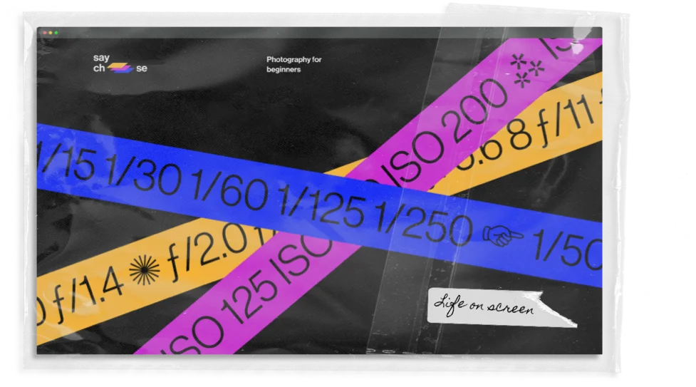
Designed by Arthur de Almeida, this interactive website teaches photography for beginners.
Created by Yifu Zhang, the website served as the opening event for the 2020 Serving the People show, exhibiting works by BFA students from art schools across the world.
Balenciaga's Fall 2021 collection was unveiled via an elaborate video game made up of five zones, where users can explore a futuristic reality and encounter model avatars.
TREND NO.1

Face
time
OUR REFLECTIONS ARE BECOMING THE STARS OF OUR SCREENS.

A face filter by Aaron Jablonski, a digital artist specializing in AR and face tracking technology.
A face filter by Aaron Jablonski, a digital artist specializing in AR and face tracking technology.
Sylvia is the first virtual influencer to age over time, created by Ziv Schneider, Halime Maloof, Odie Senesh, ANO Agency, Alex Calderwood and Bethany Tabor.
Sylvia is the first virtual influencer to age over time, created by Ziv Schneider, Halime Maloof, Odie Senesh, ANO Agency, Alex Calderwood and Bethany Tabor.
A variable typeface experiment allowing users to design a font based on their facial features and expressions. Co-created by Overtone and Set Snail.
A variable typeface experiment allowing users to design a font based on their facial features and expressions. Co-created by Overtone and Set Snail.
A tool that alerts users whenever they touch their face using a machine learning algorithm and a webcam. Created by Mike Bodge, Brian Moore and Isaac Blankensmith.
A tool that alerts users whenever they touch their face using a machine learning algorithm and a webcam. Created by Mike Bodge, Brian Moore and Isaac Blankensmith.
An open video call where a webcam records users’ facial gestures. Created by Daniel Iregui and Studio Iregular, curated by Liette Gauthier and commissioned by Maison de la Culture Ahuntsic.
An open video call where a webcam records users’ facial gestures. Created by Daniel Iregui and Studio Iregular, curated by Liette Gauthier and commissioned by Maison de la Culture Ahuntsic.
As human communication moves increasingly online, we're constantly faced with our own reflections staring back at us, placing extra emphasis on the face. Memojis, avatars and cutesy, quirky filters present altered versions of ourselves that impact our self-image. Web designers will focus on human identity as they create experiences that not only appeal to end users, but also feature them.
TREND NO.2
Your UI, by you
The following Customize button changes the visual layout only, with no screen reader indication.

FLEXIBLE INTERFACES ALLOW USERS TO CUSTOMIZE THEIR OWN LOOK-AND-FEEL, CHAMPIONING SELF-EXPRESSION AND INDIVIDUALISM.
Companies are adapting their content to fit individual users' preferences and craft more personalized experiences, like in Spotify’s end-of-year roundups and Netflix’s artwork personalization.
Users enjoy having more control of their interfaces, with choices like light or dark mode that greatly affect the design of their devices. Facebook and Instagram instant messaging now allow users to pick between various color themes.
FLEXIBLE INTERFACES ALLOW USERS TO CUSTOMIZE THEIR OWN LOOK-AND-FEEL, CHAMPIONING SELF-EXPRESSION AND INDIVIDUALISM.

Designers will create modular and modifiable assets and interfaces, while considering different types of users and how various UI options could benefit them. This will result in interfaces that are singular to each user, reflecting their taste, style and identity. Customizable interfaces will also lead to more inclusive design. Users will be able tweak interfaces to match their varying needs, from enlarging typefaces to choosing a high-contrast palette for better legibility.
TREND NO.3
DESIGN
DESIGNERS EMBRACE BOLD, ICONIC VISUALS TO STAND UP AGAINST INJUSTICE.
ACTIVISM
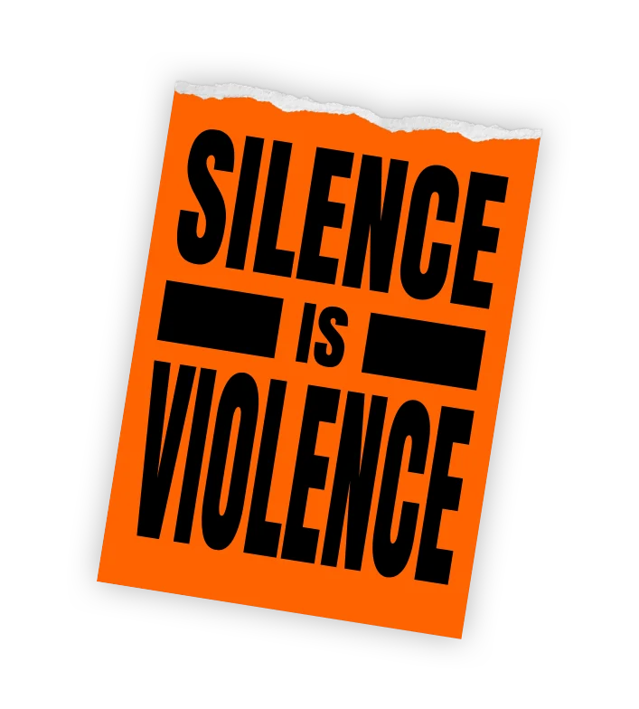
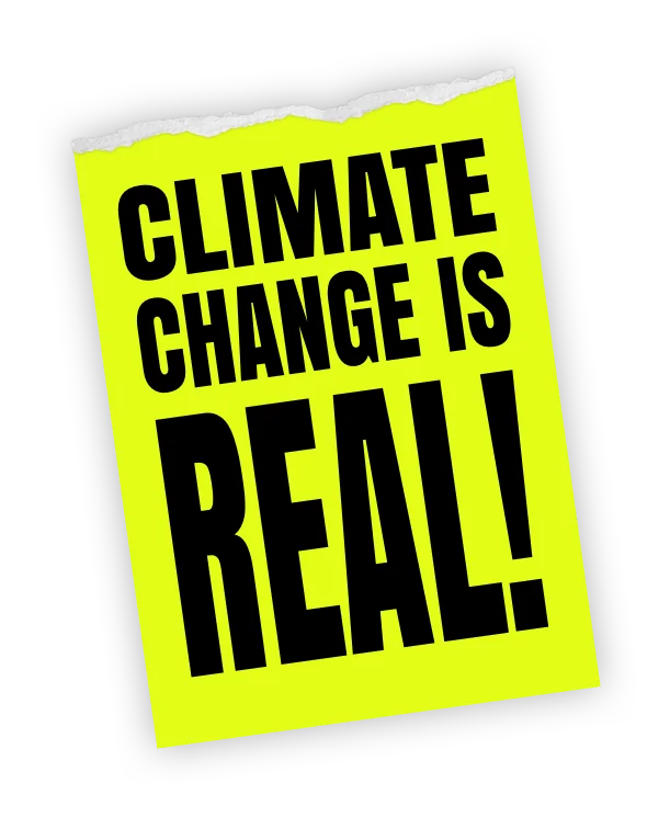
Many designers have lent their creative skills to causes they believe in, making everything from protest graphics to campaigns calling for racial, environmental and political justice. In 2021, design will keep serving as a tool to educate, empower and raise awareness on the new issues of our time. The need to convey a powerful, radical message with the hope to effect change will lead designers to create bespoke design assets, such as custom-made typefaces, illustrations and icon sets.
An open-source database of sustainable suppliers created by Michelle Mattar, Kevin Green, Johnny Dombrowski and Evan Robinson.
Operating with Slack integrations, Greenlist is a tool that empowers companies to start a sustainable office lifestyle.
A social change initiative advocating for a better future. Created by Irregular Labs and World Frontiers Forum, made possible by Gucci.
Good Glyphs by Violet Office is a collaborative dingbat font, with all profits going to Doctors Without Borders.
An illustrated website bringing awareness to the issue of immigration detention in the United States. Created by Naily Nevarez and Detention Watch Network.

TREND NO.4
Nostalgia is not new to web design, and neither is the constant pendulum swing from flat to 3D and back again. After a long reign of the flat aesthetic, we’re now in search of new and contemporary ways of adding depth to our online experiences. Websites and apps will simulate leafing through the pages of a book or magazine, creating a more material, print-like experience.
Retro
touch
TACTILE DESIGN IS BEING REINTERPRETED FOR THE SCREEN.


Furniture store Waka Waka’s website by Mouthwash Studio references print styles and grid systems.
The website design of digital media space and creative agency Miilkiina draws inspiration from traditional newspaper typography. Designed by Sometimes Always and Fluxo Design.
Collectif Silo’s website, designed by Cyril Makhoul, uses an exposed grid and is reminiscent of a newspaper.
TREND NO.5
Happy
& healthy
The RX for healthcare:
sensitivity, optimism—
and a dose of humor.


Values
Calm
Uplifting
Happy
Comic
Playful
Healthy
Diagnosis
Addressing the health and mental health crises through design
Prescription
Covid-19 resulted in a major health crisis, followed by a similar state of emergency in the mental health field. Designers are addressing the severity of these issues by prioritizing healthcare and emotional wellness. Soft, happy and even funny visuals will replace the familiar clinical-looking ones. The use of illustration and energetic color palettes will send a friendly, positive message to patients who need it, fostering a sense of optimism and wellbeing.
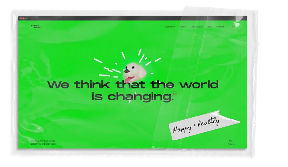
Squadeasy is a physical activity and wellbeing app for making people happier. Web design by Guillaume Azadian, Célia Lopez, Lei Xing and Soufiane Lasri.
A website visualising the global pandemic through a series of charts, made by Andrew Winter and W–Interactive.
Created by Studio Something and powered by See Me, Feels FM is an emoji-powered jukebox to help young people express their feelings, using music as a positive coping strategy.
Boost’s mission is to make health simple. They offer vitamins for the immune system, helping people get sick less often. Designed by Studio Freight and Basement Studio.
TREND NO.6
Free
STRATEGY AND COMPETITION DISTRACT US FROM REAL LIFE. HAVING FUN DOES TOO.
play
Spending too much time at home and online sets the perfect stage for digital escapism. Designers and brands have been quick to respond this year, creating websites that serve no functional purpose but to pass time—and make people feel good in the process. We’re seeing a lot of designs that feature a retro, arcade-inspired aesthetic. Other games look a lot like early screensavers, with simple and repetitive visuals. They carry no hefty message and celebrate nonsense instead.
An online game by Kobu Agency where players need to prevent coronaviruses from reaching them.
A web game created by Pavel Dobryakov inviting you to play around with colorful fluids.
Gucci’s game allows players to roam a magical garden created as part of an advertising campaign for their Bloom fragrance collection.
TREND NO.7
BRANDS
TAKE
A
STAND
COMPANIES REALIZE THEIR POWER TO DRIVE SOCIAL CHANGE.

BRANDS TAKE A STAND
A new generation of customers expect brands to own up to their position of power, and do more than provide a product. Brand language will evolve in response to current events. Designers will react in real time, creating strong visuals that send an unequivocal message of solidarity and support, as was demonstrated after the killing of George Floyd and the racial justice initiatives that followed.
Glossier has provided $500,000 in grants to the next generation of Black leaders in the beauty industry.
Outdoors clothing brand Patagonia aims to use its resources to take action against the climate crisis.
Nike blacked out its homepage in support of Black Lives Matter four days after the killing of George Floyd, voicing a clear anti-racism message.
Hudson Hemp highlights the regenerative farming techniques it uses for growing industrial hemp on its website, designed by Rebecca Zhou, Annie Kreighbaum and Rob Junge.
Developed by SPACE10, EFFEKT Architects and supported by IKEA, this project is an exploration into the sustainable and affordable homes of tomorrow.
TREND NO.8
KIND TECH
KIND TECH
KIND TECH
KIND TECH


Most people are well aware of just how addictive and manipulative tech can be, but the benefits of engaging in our digital society can outweigh the drawbacks. Web and UX designers will utilize digital wellness and calm tech principles to create safe web spaces for truthful conversation. Designers will also place a greater emphasis on data protection and the carbon footprint of online platforms, to help make the internet a better, safer environment for both people and the planet.
A solar-powered, self-hosted website, designed to reduce the energy use associated with accessing our content. Created by Kris De Decker, Marie Otsuka and Roel Roscam Abbing.
OpenWeb’s mission is to inspire and elevate an open exchange of ideas across the web, and take online conversations back from trolls, bullies and bots.
Created by technology studio IF, Society Centered Design offers design principles that take into account citizen empowerment, civic commons, public health, equity and the planet.
A social platform for people of color, meant to foster joy through deeper digital connections. Design by Annika Hansteen-Izora.
Square is a project by Geex Arts which allows designers to share their work and receive feedback, without the pressure of gaining followers and likes. Design by Slava Kornilov.
TREND NO.9

Hope by design
Let’s paint a future we can look forward to.
As we work toward a healthier, more stable society, design will become a source of inspiration and confidence in what’s to come. Optimistic visuals of blue skies, open landscapes and other natural elements will fill our designs with hope and opportunity. A prominent use of soft, pastel hues or bright, vivid colors will liven up the monotony of our days. We'll also see a rise in dreamy mesh gradients and playful typography. This joyful aesthetic will serve as a reminder that the future, if we’re so lucky, can definitely look bright.
A website sharing stories about Covid-19, with inspiring moments that remind us what it means to be human.
Fashion brand Opening Ceremony uses vast blue skies as the backdrop for its online store.
A strategy, creative and design agency that creates brands, products and experiences with the hope to move culture forward. Their homepage features a rainbow-colored mesh gradient.
Sparkling beverage brand Recess helps consumers regain their focus and relax, using pastel gradients and visuals of floating clouds on their website.
A strategic branding studio with a bold website design filled with color and emojis. Site built on Editor X.
TREND NO.10


